The Responsive Image Problem
Update (a year later!): An interesting article on the responsive image problem and improving performance using a script which enables you to modify the DOM before loading resources!
This morning I read a post in the Responsive Image Community Group by Scott Jehl detailing the latest improvements to his
A New Tag
“The picture tag? Never header of it.”
Well until this morning neither had I. In fact it doesn't really exist — well not according to the W3C anyway (which usually matters). There have been many lively discussions and posts on this topic before and since Scott posted his JavaScript poly-fill for the picture tag.
What Problems does "Responsive Images" Address?
Simply: Why should a mobile or tablet browser have to download a 1mb+ 2048x1536 image only to scale it down to fit its view-port? Scott's script provides an easy way for us to specify which images to load using markup with inline media queries. This markup could be adopted by W3C and implemented in the latest browsers. Great work!
Unfortunately, it's never that simple. It would be risky to use this in a production environment — markup can and probably will change before it becomes a standard. The picturefill.js script implements a detection for a browser implementation of the picture tag which is only a good thing if the implementations end up being compatible.
If I were ever going to use this in the wild before any standards have been agreed on, I'd treat this script as a dependency for my site i.e. a library that my site uses to work. This means, of course, that I couldn't use the picture tag and would probably change the script to work with something like
Another big disadvantage would be that the image can only start loading after your script has run. This is not to say that Scott is advocating using the script "as is" in a production environment — merely suggesting that it can be used to solve this problem in some form or another.
Did you know that...?
picturefill.js depends on the matchmedia.js script for parsing and matching media queries.
Now you know!Let's get to some Markup!
The markup is pretty easy to understand especially if you know a bit about media queries. The ) based on the media query.
Demonstration
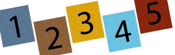
I've included a demonstration of this on the page. Go ahead and resize! The number images change in accordance with the view-port.
Beneath that a larger or smaller image is loaded depending on the view-port width. For example, on a mobile phone it loads a 39kb 340x227 image whereas on my desktop it loads a 903kb 2400x1600 image. As in the example markup above changes occur at view-port widths of
EDIT: After doing a bit of post-wrote-your-blog browser testing I found that the script doesn't work in IE9. It works on the mobile browsers I've tested with (Android only).
Image demo:
Conclusion
As much as we would love to have a definitive solution to this problem now, using this script as a poly-fill instead of a library might lead you to have to fix your site down the road. But that's not really the point — work like Scott's gives us a way to test out ideas and see what the future holds for us. From this, we gain a fascinating incite into how ideas/problems develop through the community into the standards and markup we use. This is the internet and we all have a say!
No Responses
rss feed